TuitionTrim
A website solution for students to navigate the financial complexity of college tuition
Overview
InstateMe is dedicated to making higher education accessible to all students, regardless of background or connections. Founded with residency expertise, InstateMe has helped students save an average of $80,000 on tuition by providing personalized guidance and support.
For this project, I designed TuitionTrim, an extension of InstateMe’s services. I focused on creating a clear, accessible platform to help students simplify financial management and understand college expenses.
My Role
I worked as the UX designer on this team. I engaged in lo-fi and mid-fi designing and collaborative design iteration
Scope
UI/UX Design, Wireframing, Prototyping
Timeline
Ongoing, Started January 2024
THE PROBLEM
Students often face overwhelming financial burdens as they navigate the complex landscape of tuition payments, i.e. loans, scholarships, grants, etc.
The Problem
The lack of a centralized platform forces students to juggle multiple funding sources, deadlines, and platforms, creating confusion and stress. Without a holistic view of their finances, proactive planning becomes difficult, leading to missed cost-saving opportunities and increased debt.

Provide a tool to help students make better college tuition decisions
GOAL
How might we…
1
Simplify the tracking of multiple tuition funding sources.
2
Empower students with personalized financial insights to make informed decisions about their college funding options.
3
Facilitate cost-reduction strategies—such as increasing gift aid and lowering tuition—in a clear, comprehensive, and actionable way.
Why do so many students struggle with managing tuition and paying for college?
RESEARCH
STATISTICS
Our research consists of a statistical analysis to understand college affordability. By examining statistics, we identify students' financial challenges with tuition payments.
How big is this problem?

31%
Increase in average tuition from 2008-2018
$
70%
Of students graduate with student loans

$8 billion
State funding cut toward public higher education

COMPETITIVE ANALYSIS
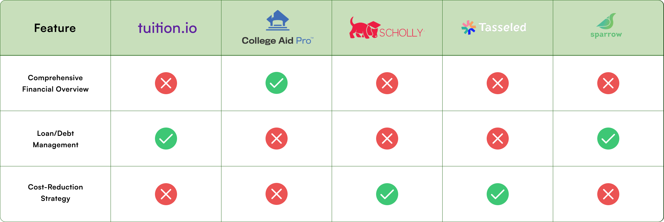
We also did a competitive analysis to understand what current tools are available for college tuition affordability. This analysis will help us find gaps in existing services.
Analyzing the current market
INSIGHTS
Companies adopt a reactive approach to minimizing tuition costs
Research revealed that:
Most tools take a reactive approach, focusing on reducing debt after it has accrued rather than proactively minimizing it.
The fragmented and overwhelming process of managing multiple funding sources (FAFSA, loans, scholarships, etc.) leaves students without clarity or effective strategies, increasing financial strain and missed opportunities for cost savings.
Creating a proactive approach to managing and reducing tuition costs
IDEATION

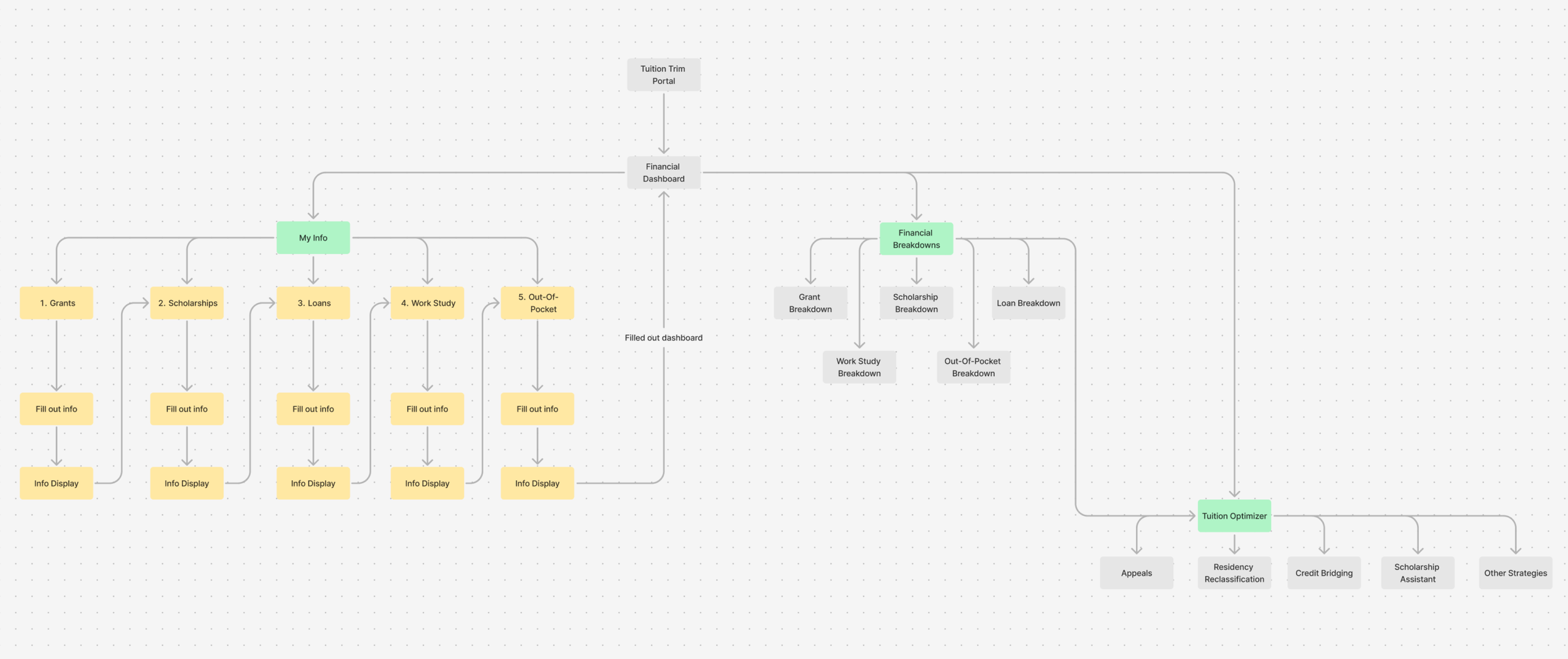
Brainstorming a seamless information architecture flow
We want the user to go from inputting financial information to viewing their financial insights to tuition optimization.
FIRST ITERATION
We created a very rough first iteration
Our first iteration served as a starting point, but it struggled with information overload, user confusion, and unnecessary complexity in the flow. Let’s walk through these designs and explore how we can simplify and enhance the overall experience.
I wanted to show how we might simplify the tracking and inputting of multiple tuition funding sources but...
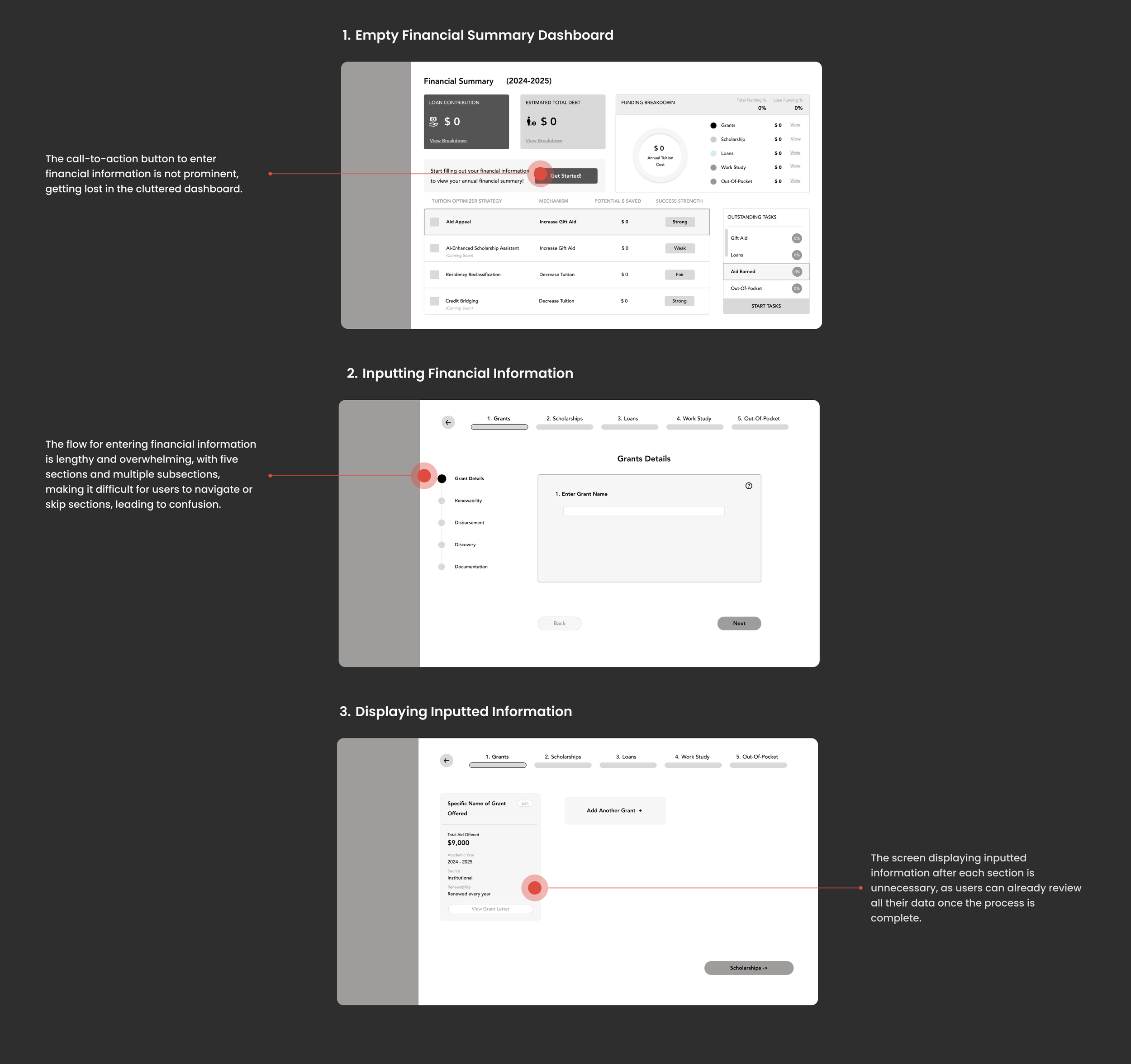
I also wanted to show how we might empower students with personalized financial insights and facilitate cost-reduction strategies in a clear and actionable way but...
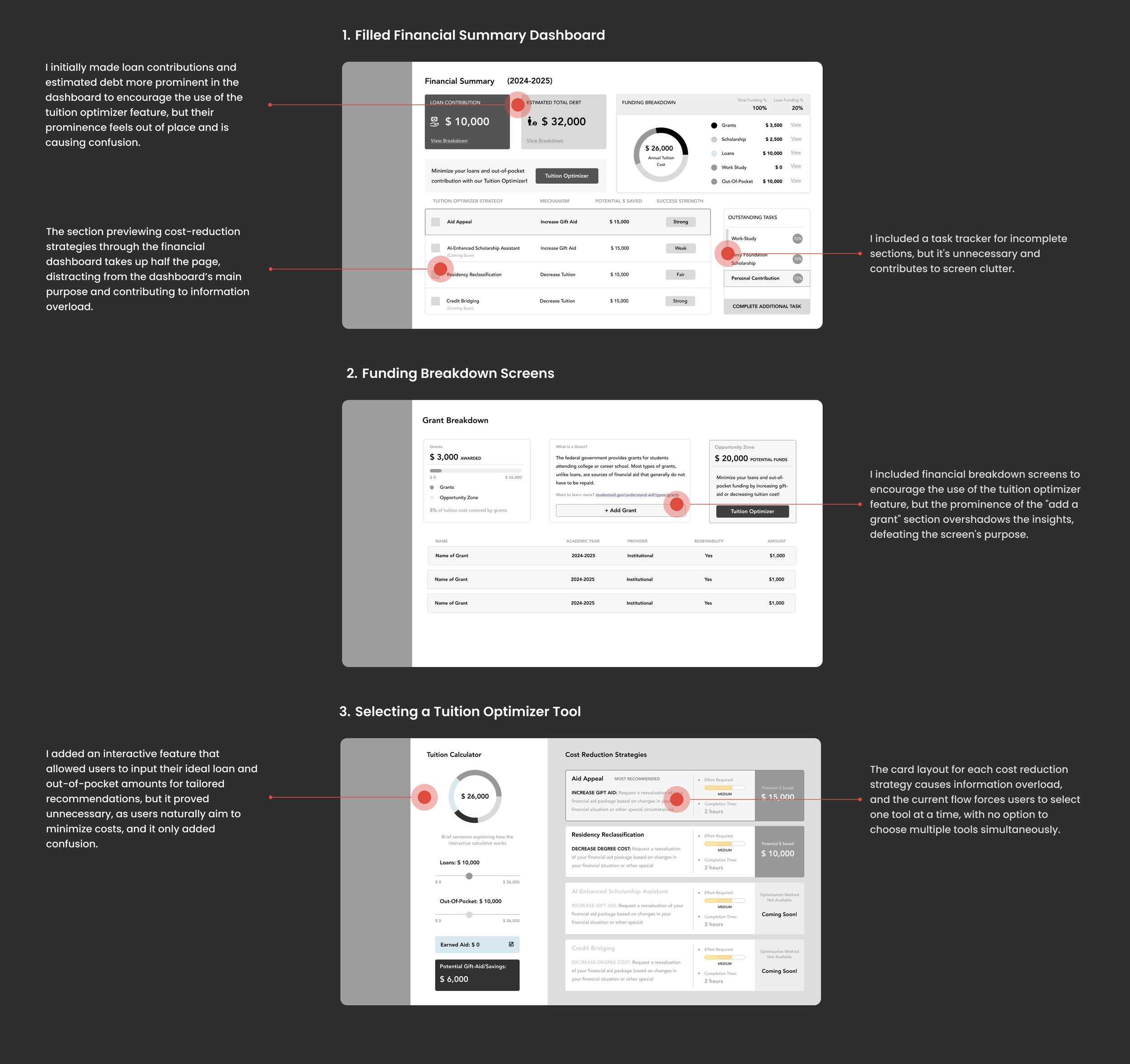
Insights from our first iteration revealed key challenges that must be addressed to streamline tuition management and support proactive financial planning.
Second Iteration
What needs to be fixed
1. Confusing Information Input Process
The step-by-step approach convoluted our goal of simplification, making financial management feel more complex and overwhelming for students.
2. Overwhelming Dashboard Design
The dashboard does not effectively highlight key financial points, making it difficult for students to focus on the most critical aspects of their finances.
3. Limited Flexibility in Cost-Reduction Strategy Selection
Limiting students to a single cost-reduction strategy restricts their ability to maximize savings and tailor solutions to their unique financial needs.
Streamlining the information input flow by separating public and private funding sources
We separated the input of public and private funding sources because public funding—such as grants, loans, scholarships, and work-study—is typically grouped in a student’s financial aid letter and regulated by the federal/state government or the institution, making it easily tied to the student. In contrast, private funding sources like private loans, scholarships, and personal contributions are not publicly accessible and require manual entry.
To reduce the cognitive load and user effort, we integrated an AI tool that scans financial aid letters and automatically inputs funding details.


Redesigning based on the new information architecture flow


FINAL DESIGNS
Quick and Simple Onboarding
I designed an onboarding flow where students input state and university details. This leads to a dashboard with tuition and cost of attendance, followed by options to enter financial details or explore cost-reduction strategies.
Streamlining Information Input
We restructured the input process into two flows—public (e.g., FAFSA-based grants, loans) and private (e.g., private loans, scholarships)—to eliminate confusion, simplify financial tracking, and empower students to make better cost-reduction decisions by allowing them to input only available information or skip ahead.
Entering Public Funding
Entering Private Funding
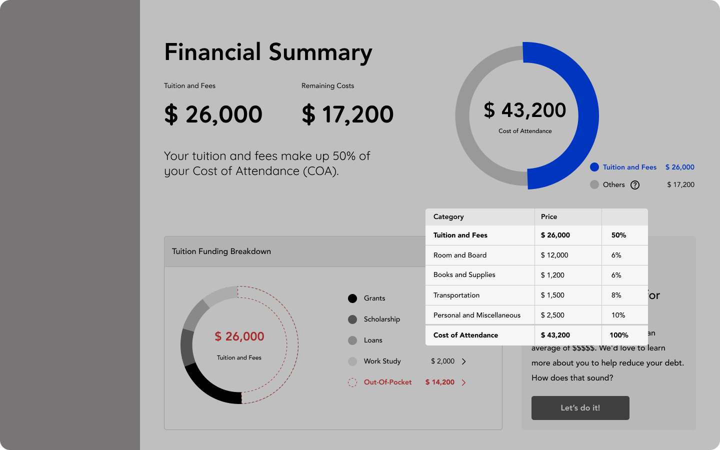
Comprehensive and Easy-to-Follow Overview of Finances
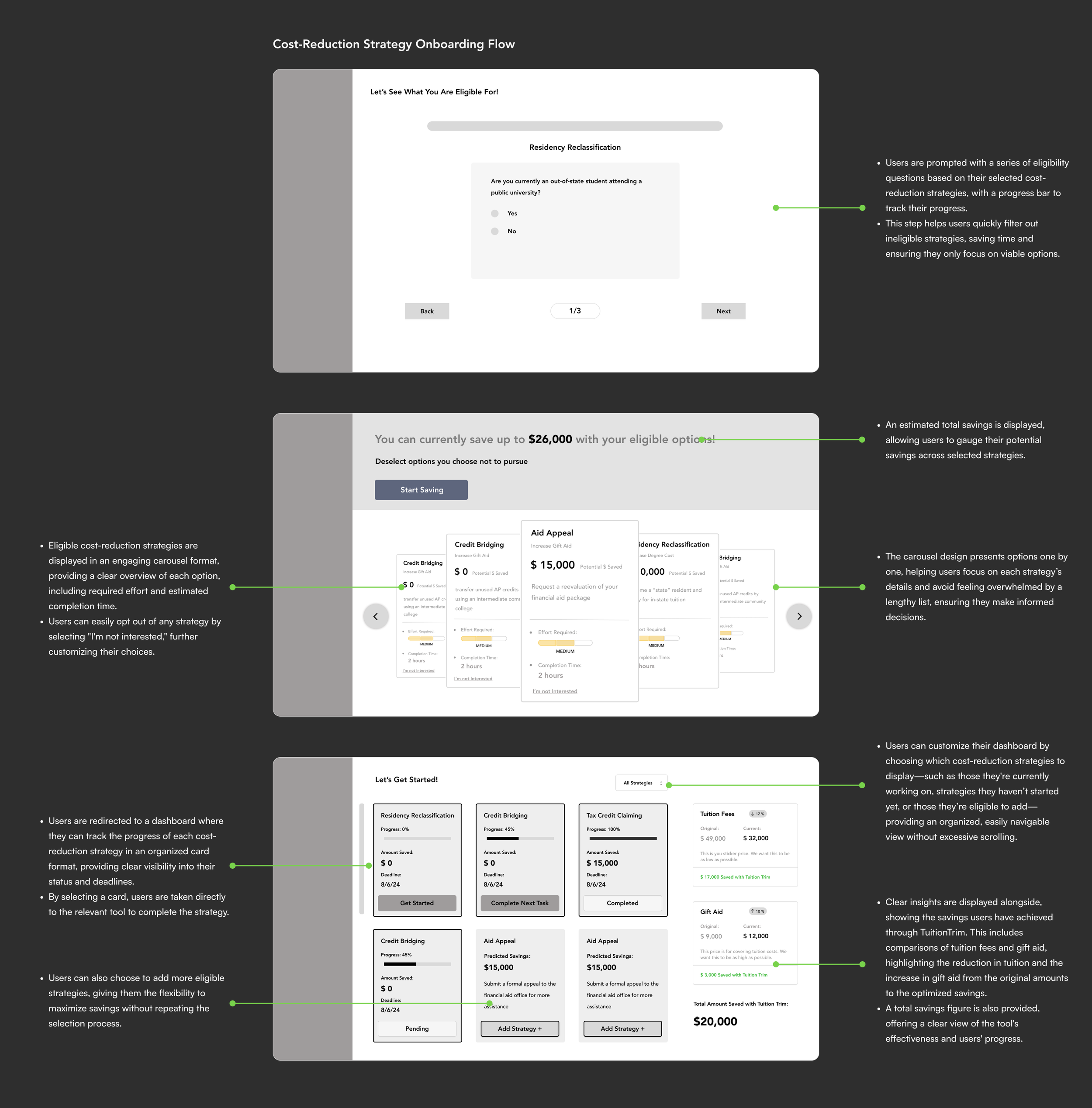
We redesigned the dashboard and funding breakdown screens to simplify tuition management. By highlighting essential information, presenting financial details in an organized format, and emphasizing tailored savings strategies, we empower students to make informed, proactive decisions.
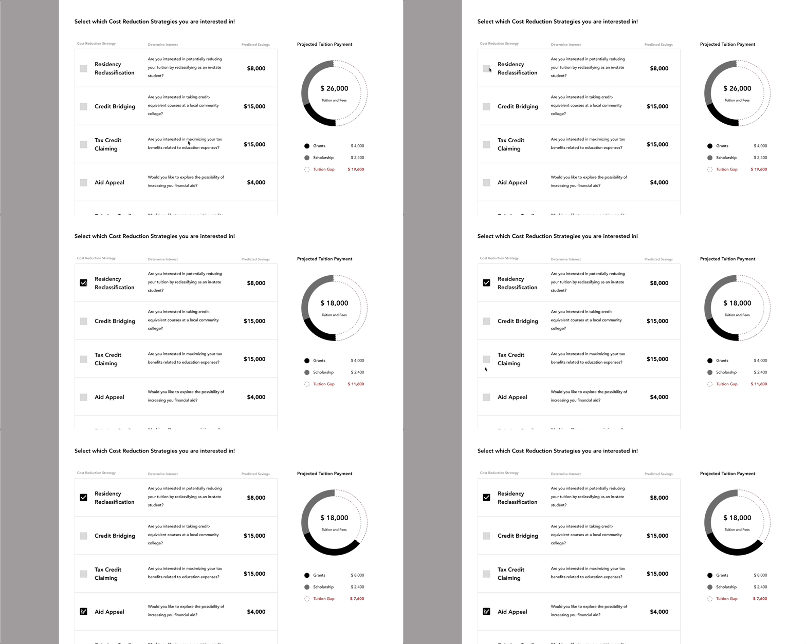
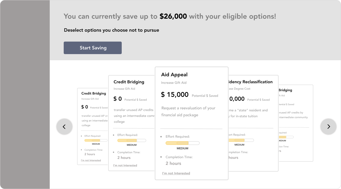
Flexible Cost-Reduction Strategy Tool Selection
We updated the flow to guide students in proactively reducing tuition costs and debt by offering an interactive calculator, tailored savings strategies, and a simplified dashboard to track progress, encouraging clear, informed financial planning.
Measuring Success
To measure the effectiveness of my design solutions, I conducted user testing on both the first and second iterations. This allowed me to compare performance across key metrics such as efficiency and user satisfaction. By observing how quickly and smoothly participants completed tasks, alongside collecting direct feedback, I was able to validate where the design improved and identify opportunities for further refinement.
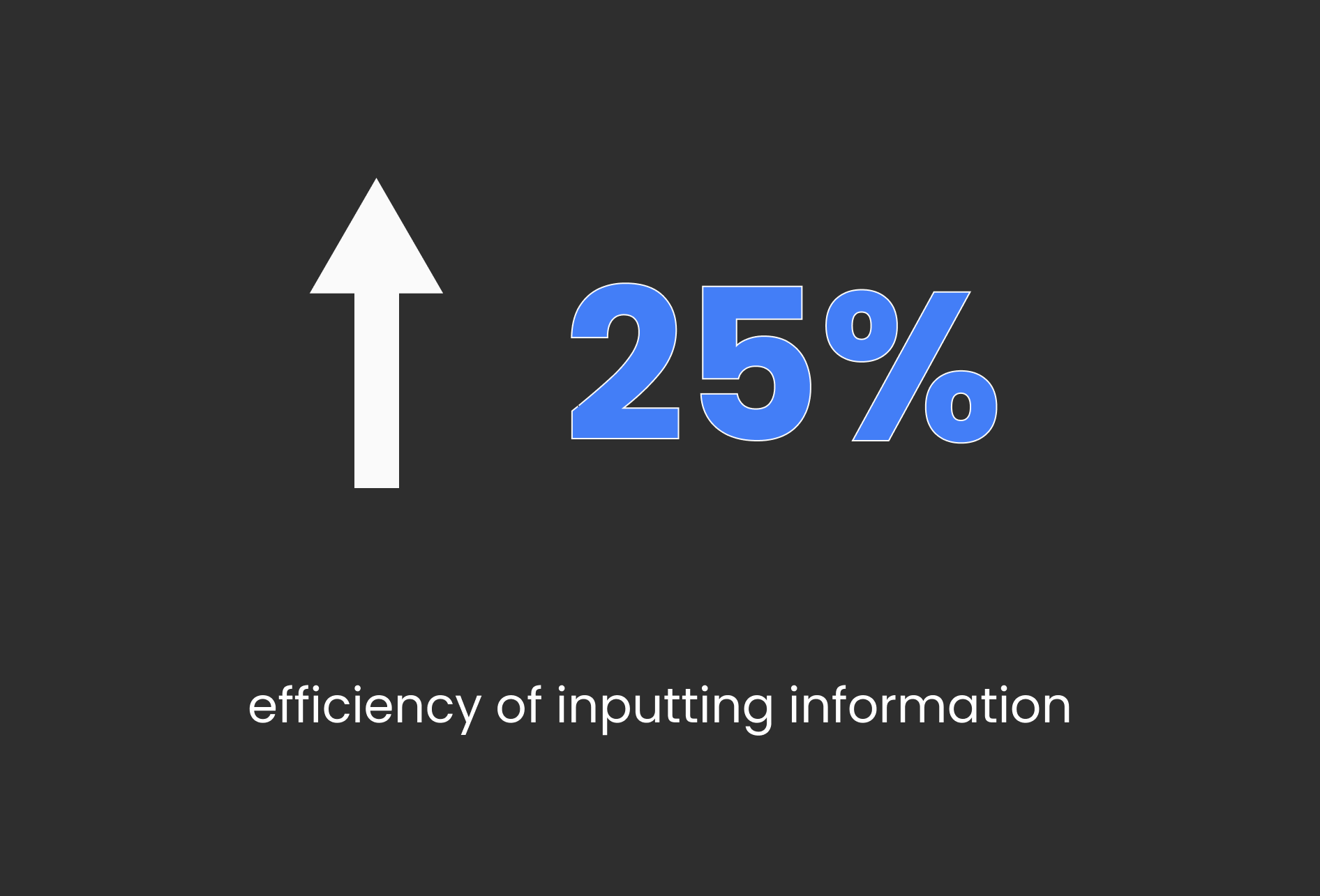
Efficiency
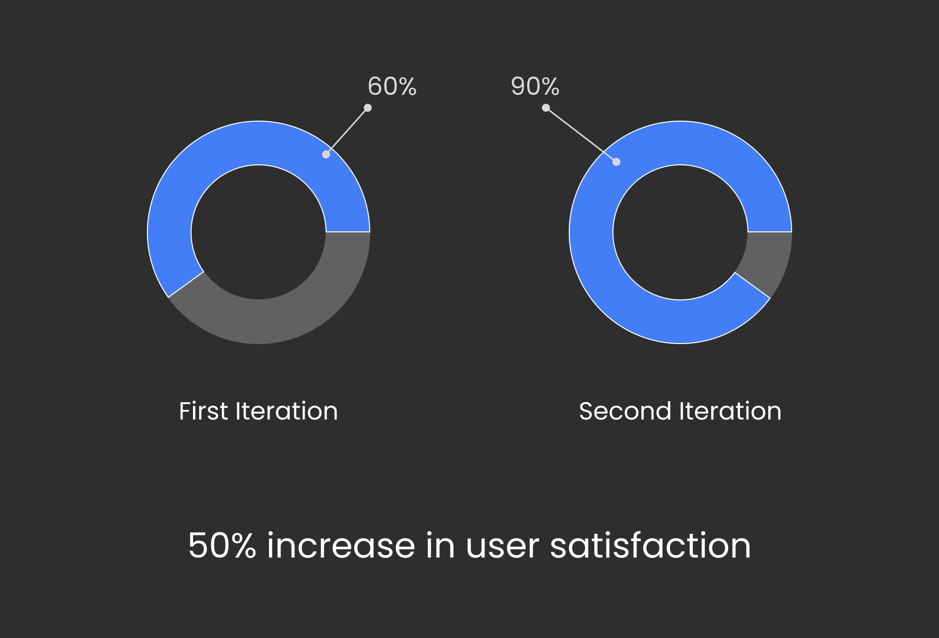
User Satisfaction
What I Learned…
Less is More
Simplifying designs greatly enhances user experience. I learned that overwhelming users with excessive information leads to confusion and disengagement. By focusing on the essentials, I was able to streamline user flows and prioritize critical information, making navigation and platform use much easier.
Embracing the Learning Curve
Exploring financial literacy for college funding was a valuable learning experience. Although I was initially unfamiliar with the complexities of grants, loans, and scholarships, I developed empathy for users who navigate this confusing landscape, which informed my design decisions to better meet their needs.
Being an Adaptable Designer
The design process often requires flexibility, as product direction can change dramatically throughout development. I learned the importance of being open to feedback and being willing to pivot based on new stakeholder needs and evolving project goals.
What's next for this project
Conduct additional usability testing to gather insights and refine functionality.
Create high-fidelity prototypes to enhance design details and user experience.
Develop cohesive branding to align with the platform’s purpose and appeal to target users.


